I have written about this before and, having reflected on whether my position has changed over the past five years or so, I have come to the same firm conclusion: a printed PowerPoint presentation is not a paper. A slide deck is not a policy document. Bullet points, coloured boxes and nice pictures cannot substitute for a formal written position.
As higher education institutions face into more and more challenges, executive boards and governing bodies are going to be taking some difficult decisions about the future. They will be meeting with strategic planning teams and quite possibly external consultants to explore options. To ensure they reach well-founded and sound conclusions, board members need to consider properly prepared and presented papers, not PowerPoint presentations masquerading as documents.
In the big scheme of things this is, of course, not perhaps near the top of the list for many people. And probably should not be for me either. But I really do think PowerPoint does need to be put properly in its place even though there are bigger concerns about AI-generated material substituting for real effort.
PowerPoint as crutch
It all used to be really straightforward. A report or a paper was a typed, clearly presented A4 paper, which may have some diagrams or appendices but offered a clear and structured narrative – the focus was on share and succinct presentation of argument in order to seek approval for a proposal based on evidence or to share relevant information.
Technology has changed matters though and it is now commonplace for PowerPoint to be used instead of Word or similar for reports or papers. This is not a good thing. I am talking here about both presentation and the issue of substance, of weight, of heft. A set of slides may look good but it simply does not enable the conveyance of anything other than headlines.
And this is before we get onto the use of AI to generate material. More of that later.
Over the years there has been much criticism of PowerPoint for presentations, particularly the way in which if it is used poorly it serves as a crutch for a poor presenter, and merely offers a vehicle for reading out text on a screen. For example this Harvard Business Review article is damning about the quality of most of the 30 million PowerPoint presentations delivered daily (!) and recommends a completely different approach to making a memorable engagement.
One of the responses to this fairly widely held view has been more creative presentation software and greater attention being paid to good presentation style and techniques. This though does not necessarily overcome the fundamental problems with PowerPoint – it changes the message.
Not rocket science
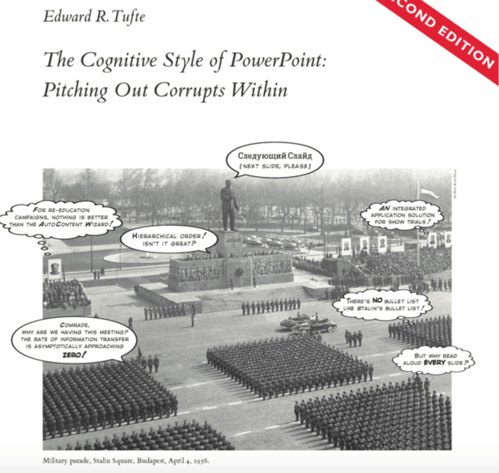
A key paper by Edward Tufte on this pulls apart the use of PowerPoint in considering the Columbia disaster in 2003 – ‘PowerPoint Does Rocket Science–and Better Techniques for Technical Reports’. The report concludes:
He also offers a wider analysis of the problems with PowerPoint in this short text with a bold cover:
‘How PowerPoint Makes You Stupid’
Beyond NASA, where the use of PowerPoint was endemic, there has also been a sustained critique of the use of PowerPoint to drive both military and political strategy. A key early text on this is pictured above – ‘How PowerPoint Makes You Stupid’:
With over 500 million users worldwide, Microsoft’s PowerPoint software has become the ubiquitous tool for nearly all forms of public presentation—in schools, government agencies, the military, and, of course, offices everywhere. In this revealing and powerfully argued book, author Franck Frommer shows us that PowerPoint’s celebrated ease and efficiency actually mask a profoundly disturbing but little-understood transformation in human communication.
Using fascinating examples (including the most famous PowerPoint presentation of all: Colin Powell’s indictment of Iraq before the United Nations), Frommer systematically deconstructs the slides, bulleted lists, and flashy graphics we all now take for granted. He shows how PowerPoint has promoted a new, slippery “grammar,” where faulty causality, sloppy logic, decontextualized data, and seductive showmanship have replaced the traditional tools of persuasion and argument.
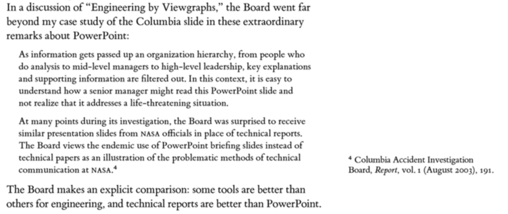
Both of these examples, Columbia and Iraq, focus on the use of PowerPoint as a flawed and dangerous presentational tool and, as Tufte notes, the Columbia Accident Investigation Board is damning on the use of PowerPoint instead of technical reports for consideration of complex matters in NASA:
Tufte has criticised more broadly the way Microsoft PowerPoint is typically used. In his essay “The Cognitive Style of PowerPoint”, he criticises many aspects of the software:
- Its use to guide and reassure a presenter, rather than to enlighten the audience;
- Its unhelpfully simplistic tables and charts, resulting from the low resolution of early computer displays;
- The outliner’s causing ideas to be arranged in an unnecessarily deep hierarchy, itself subverted by the need to restate the hierarchy on each slide;
- Enforcement of the audience’s lockstep linear progression through that hierarchy (whereas with handouts, readers could browse and relate items at their leisure);
- Poor typography and chart layout, from presenters who are poor designers or who use poorly designed templates and default settings (in particular, difficulty in using scientific notation);
- Simplistic thinking—from ideas being squashed into bulleted lists; and stories with beginning, middle, and end being turned into a collection of disparate, loosely disguised points—presenting a misleading facade of the objectivity and neutrality that people associate with science, technology, and “bullet points”.
The end of the world as we know it?
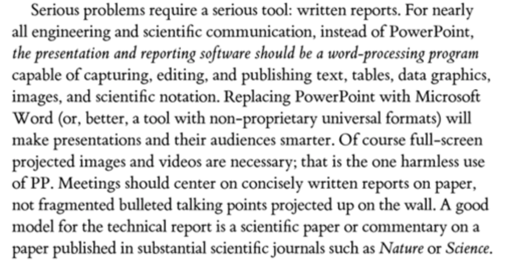
Despite the rather bullet-pointy list the powerful argument here is about the distracting and misleading nature of PowerPoint as a presenting tool in terms of undermining effective and informed decision-making. A similar concern applies to where it is used in printed form and described as ‘a paper’. The same problems apply and, as Tufte puts it, “serious problems require a serious tool: a written report.” His argument is about scientific or engineering papers but applies equally to business (or indeed higher education) challenges where we need a focus on concise, clear, well-argued and properly evidenced papers.
But we seem to get more and more PowerPoint presentations, especially from consultants, masquerading as papers. It may be that universities are the last places to be subjected to this and it is certainly now commonplace in politics and government as the primary means of written communication but it still feels strange and wrong to me when consultants arrive with a pack of spiral bound landscape slides (always in colour, despite the cost of printing) which they describe as a paper, proposal or report. Very occasionally such documents do actually work as effective reports but that is pretty unusual in my experience.
It is certainly the case that you can create nice pictures, graphs and text boxes in PowerPoint but these documents are usually lacking in detail, argument and, often, evidence. They look pretty snappy though which I guess is the point. And of course you can only skate over the pictures, never really getting into the detail of the argument and the whole thing often feels superficial and unsatisfying, especially if said consultants end up sharing their arguments as if delivering a presentation or, worse still, use the slides as a desk-based presentation. You end up with all the disadvantages of PowerPoint and none of the benefits (whatever they might have been) so it is neither one thing nor the other.
“Like a Cartier watch“
One of the salutary lessons on this issue, which is not so much about PowerPoint as it pre-dates such technology, is the use of coloured tables, pie-charts and graphics, to persuade the cabinet of the merits of a new method of local government financing. The outstanding book The Blunders of Our Governments by Ivor Crewe and Anthony King describes this seminal event from 40 years ago thus:
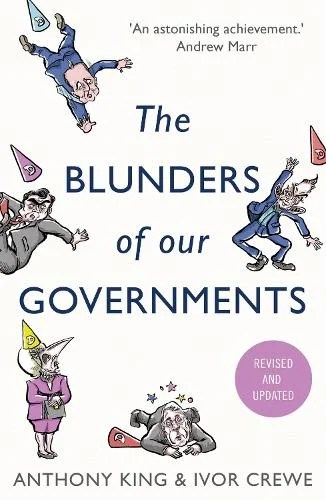
At a meeting at Chequers on Sunday 31 March 1985, a meeting etched in the memories of all who attended, the review team presented their conclusions. No formal papers were circulated in advance, and some of those present were not clear what the purpose of the meeting was. Half the cabinet turned up, along with members of the review team, Lord Rothschild and a handful of civil servants, but the chancellor of the exchequer, Nigel Lawson, stayed away, sending along a deputy instead. Baker and Waldegrave both spoke. “Colour slides, with numerous tables and pie-charts, were used for illustration, and the chairs in the Chequers drawing room were arranged theatre-style for better viewing.”
These were the plans for the introduction of what became known as the Poll Tax, arguably one of the biggest of all the blunders covered. The Times review of the book amplifies the impact of the session:
The authors describe the fateful Chequers meeting at which Thatcher was persuaded by a group of ambitious ministers that the plans were beyond all rational criticism: “The slides,” someone present said later, “were beautiful, like a Cartier watch.” The prime minister agreed. According to an official, she described it over lunch afterwards as “the best presentation I’ve ever seen”.
That was to be expected. The main political architect of the presentation was a Fellow of All Souls, William Waldegrave — and the tight little team behind the idea were all men with stellar academic backgrounds. What they completely failed to understand was human nature — and in particular how those on the margins of society would simply refuse to pay.
It wasn’t PowerPoint but the effect was the same, despite the lack of technology.
All bets are off
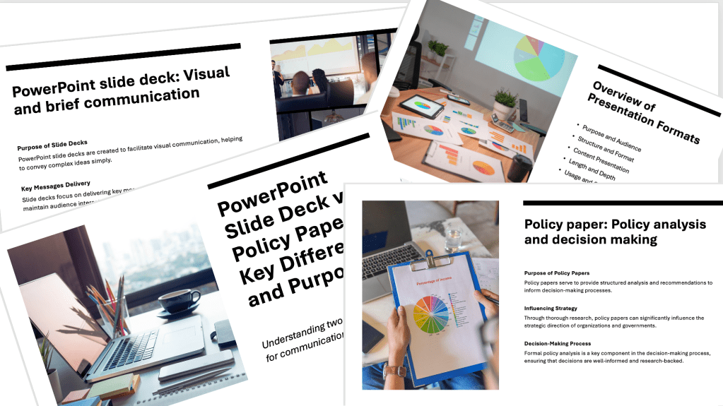
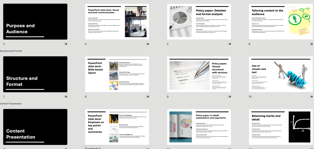
I know this is a losing battle. It was already an uphill one before the advent of Copilot and the like. Asking Copilot to develop a presentation on the arguments about PowerPoint versus written papers delivers a cogent and well-structured 23 page slide deck which represents all the arguments above in a much clearer way (and at only modestly unreasonable environmental cost). Have a look at a couple of the slides here:
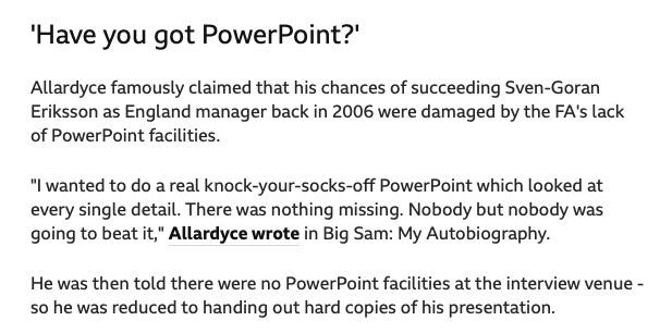
Depressing, isn’t it? However, one final thought on what happens when there aren’t the facilities to enable a PowerPoint presentation. This recollection from Sam Allardyce, football manager, who claimed not being able to present using PowerPoint had a major impact on his career:
Leaving aside Big Sam’s concerns there’s no way I’m over-reacting here. I for one would happily ban PowerPoint for anything other than brief presentations which supplement a formal paper and even with these insist on a very low word count per slide. What is your view of PowerPoint for papers? Ban it, or has the ship already sailed?

Leave a comment